


25/ Dishonest charts, US-China power struggles and remote sensing
Visual journalism tools and insights from March and April.

Welcome to the 25th issue of Nuanced,
Currently focused on learning and using satellite image sensing with new AI-powered tools (linked below) and visualizing the data in 3d map environments to be viewed in headsets (preparing for the next-gen Vision headsets). If you're reading this and have experience with this or would like to collaborate, let's get in touch.
I'm also looking for examples of gaussian splats being used for journalism, I'm excited about the potential there.
Let’s dive in.
Inspiration
My favorite visual project this month is Your Home Without China, by Pablo Robles, Agnes Chang and Lazaro Gamio. I can't stop scrolling through it.

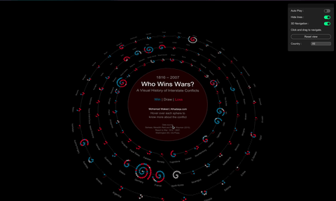
The follow-up is Who Wins Wars by Mohamad Waked. I can't begin to imagine the data and development work behind this visualization, which will look amazing experienced in mixed-reality.
The US-China Power Struggle, Mapped
Is America losing its grip on the world, or is it letting go? When the US Secretary of State calls the system America built "obsolete" and a "weapon," something fundamental has shifted. Watch the latest Buried Signals episode 👇
Decoded
This month I've published two episodes of Decoded, on how I ran OpenStreetMap data analysis of Swiss gasthof naming patterns and on the methodologies and data sources used for the US-China Power Struggle episode.
Useful
New tools I’m grateful for and recommend.
Defense Against Dishonest Charts by Nathan Yau
Get Google Directions as GeoJSON by Brody Smith
Blender MCP just made doing quick 3d renders possible and fun
QGIS MCP, not very user-friendly yet in my opinion but curious to see where it goes.
OSINT by country, thanks to Ben Heubl for sharing the resource
I haven't used these remote sensing tools yet, but planning to test them in an upcoming episode.
Thanks for reading!